Beyond the Plumbob: Designing ‘Cozy-Vibrant’ Hubs and Calm Digital Spaces
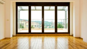
If you’ve spent any amount of time scrolling through Simstagram or browsing the latest builds on the gallery lately, you’ll have noticed a bit of a shift in the wind. For years, the community seemed to be obsessed with what I like to call "sad beige" minimalism. Everything was white, grey, or wood-toned, aiming for a sterile kind of perfection that looked more like a high-end estate agent's brochure than a home where anyone actually lived. But recently, things have taken a much more colourful turn. We are currently right in the middle of a "cozy-vibrant" revolution, and honestly, it is about time.
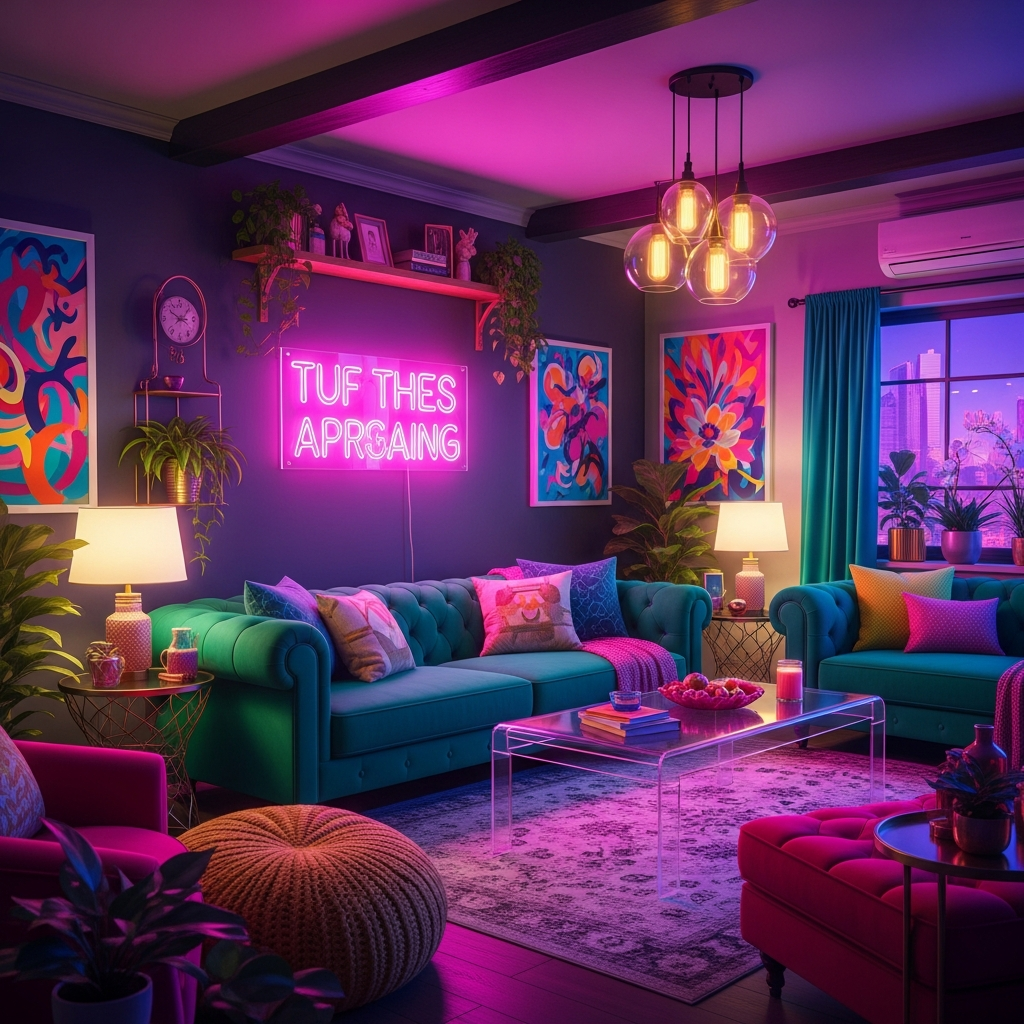
Many of us have experienced that specific burnout that comes from trying to make every room perfectly symmetrical and neutral. It gets a bit boring, doesn't it? The move away from minimalism isn't just about being messy; it's about reclaiming personality. This new trend is all about high-saturation colours, neon accents, and enough clutter to make a real-life minimalist faint. It’s about creating digital spaces that feel alive, warm, and, most importantly, fun to be in.
The 'Cozy-Vibrant' Revolution: Why Modern Designers are Moving Away from Minimalism
So, why are we suddenly ditching the Scandi-chic look for something that looks like a neon jungle? I find that it usually comes down to how we want our digital spaces to make us feel. Life can be a bit grey sometimes, especially when the British weather is doing its usual thing outside the window. When we boot up a game, we often want the exact opposite of that gloom. We want a space that feels like a hug, but one that’s also throwing a bit of a party.
The "cozy-vibrant" aesthetic blends the comfort of a lived-in home with the energy of a cyberpunk cafe. It’s about layering. You might have a plush, velvet sofa in a deep emerald green, but you’ll pair it with a translucent coffee table and a glowing pink neon sign on the wall. It’s a bit of a maximalist’s dream. This style allows players to tell a story through their builds. Instead of a room that says "I own a vacuum cleaner," these rooms say "I collect vintage records, I have too many plants, and I really like how light reflects off purple glass."
It’s also worth noting that this shift mirrors a broader movement in interior design circles. People are tired of everything looking the same. In the virtual world, where we aren't limited by our bank balances or the laws of physics, why should we settle for a beige rug? We’re seeing more players experiment with lighting to create mood, using hidden lights to make rooms glow from the floor up, rather than just sticking a standard lamp in the corner and calling it a day.
Colour Theory & Texture: Using Neon and Translucent CC to create a 'Pop' Aesthetic
If you’re looking to get started with this look, you’re going to want to head straight for the Custom Content (CC) sites. To really achieve that "pop" aesthetic, you need to think about how light interacts with different surfaces. Standard textures can look a bit flat, but neon and translucent materials add a layer of depth that changes everything.
Translucent furniture is a massive part of this. Think acrylic chairs, lucite desks, and glass shelving that catches the light. When you place a neon light near a translucent object, the colour bleeds through the edges, creating a soft, ethereal glow that feels very modern. Many creators have been leaning into this, producing sets that look like they’ve been plucked from a futuristic city but kept for a suburban lounge.
When it comes to the colour palette, we aren't just talking about throwing every colour at the wall and seeing what sticks. The most successful cozy-vibrant builds usually pick a core "vibe." Maybe it’s a "bubblegum sunset" look with pinks, oranges, and purples, or perhaps a "cool lagoon" feel with teals and electric blues. The key is to have a "pop" colour that stands out against a slightly more grounded base.
For those looking for inspiration on how to balance these bright, bubbly palettes, you can find some fantastic examples of this specific visual language at sites like Rainbow Riches Casino. The way they use distinct, saturated shapes and a "bubble" aesthetic provides a great reference point for how to make bright colours feel cohesive rather than chaotic. It is all about how those rounded shapes and glowing edges work together to create something that feels satisfying to look at.
The Psychology of the 'Pop': How Cluster Mechanics and Satisfying Visuals Reduce Simulation Fatigue
Have you ever found yourself staring at a build for four hours, unable to decide where a single window should go? That’s simulation fatigue. It’s that point where your brain just sort of stops processing the 3D space effectively because you’ve been looking at it for too long. This is where the psychology of the "pop" comes into play.
There is something inherently soothing about certain visual patterns and mechanics. In design, we often talk about "cluster mechanics," which is essentially the way groups of similar objects or colours satisfy our brain's need for order within chaos. This is why we find things like "bubble" visuals or matching sets so pleasing. They provide a quick hit of visual satisfaction that acts as a reset for the mind.
When you're taking a break from a long building session, you might find yourself alt-tabbing to something else for a few minutes just to clear your head. Many players look for something that mimics the satisfying "pop" and "click" of a well-placed decorative item. For example, the bouncy bubbles slot is a prime example of "Mega Match" cluster mechanics that simulation players often find incredibly satisfying. The way the symbols interact and clear the screen mirrors that same sense of accomplishment you get when you finally get the "moveobjects" cheat to work perfectly and your clutter snaps into place.
These little digital interludes are vital. They use bright, clear colours and satisfying physics to give the brain a break from the complex spatial reasoning required for building a three-storey mansion from scratch. By engaging with a different kind of "pop" mechanic, you can return to your build with a fresh set of eyes and a better sense of how to use colour in your own virtual rooms.
Creative Breaks: Casual Visual Elements to Complement Long Design Sessions
Building in the Sims is a marathon, not a sprint. I’ve often started a "quick" kitchen renovation at 8 PM, only to find myself still choosing cabinet handles at 2 AM. To keep the process enjoyable, it is important to have these little "digital interludes." These are short, low-stress activities that complement the creative process without being too demanding.
Casual arcade-style games are perfect for this. They don't require you to remember a complex plot or master difficult controls; they just offer a bit of visual candy. I often find that playing something with a bright, neon aesthetic helps keep my creative juices flowing even when I’m not actively building. It keeps your brain in that "colour-matching" headspace.
Think of it like a palate cleanser between courses at a fancy dinner. If you spend too much time staring at roof pitches and wall heights, you lose your sense of perspective. A quick ten-minute break with something visual and fast-paced can help you recalibrate. It’s about finding that balance between the slow, methodical pace of architectural design and the quick, satisfying feedback of arcade mechanics.
Community Spotlight: Top Neon-Themed Build Downloads for SimCookie Readers
To wrap things up, I wanted to point you toward some of the best ways to bring this cozy-vibrant look into your own game. The community has been incredibly busy lately creating some truly stunning lots that lean into this neon-heavy, high-texture style.
- The Cyber-Cottage: This is a brilliant sub-genre where players take a traditional cottagecore shell and fill it with high-tech, glowing CC. Imagine a thatched roof but with neon vines climbing up the sides and a kitchen full of translucent plastic appliances. It’s a wonderful contrast that feels very "now."
- Vapourwave Penthouses: If you’re playing in San Myshuno, you have to try a vapourwave-themed apartment. Look for builds that use a lot of pink and blue area lighting. These lots often feature "sunken" living rooms filled with glowing cushions and plenty of glass partitions.
- Neon Nightclubs: While we’re talking about hubs, the community has completely reinvented the nightclub lot type. Instead of the dark, dingy basements of the past, these new builds are bright, airy spaces filled with translucent dancefloors and custom neon signage.
Creating these spaces is more than just a design exercise; it’s about making a digital world that feels vibrant and full of life. Whether you’re a long-time builder or someone who just likes to download pretty houses from the gallery, I really encourage you to embrace the "pop." Move away from the greys and the beiges, find some translucent CC that makes you smile, and don't be afraid to use a bit of neon. Your Sims—and your brain—will thank you for it.
Disclaimer: Please remember to play responsibly. These digital spaces are meant for relaxation and creativity. If you choose to engage in any form of online gaming or casual play, ensure you are over 18 and mindful of your limits. For more information on staying safe and keeping things fun, visit BeGambleAware.org.